Key Takeaways
- Increased emphasis on AI-driven personalization that shapes user experiences.
- Blend of minimalist designs and emerging 3D interface elements to boost user engagement.
- Prioritization of accessibility and navigation to ensure usability across a diverse user base.
Table of Contents
- AI-Driven Personalization
- Minimalist Aesthetics with 3D Elements
- Enhanced Accessibility Features
- Gesture-Based Navigation
- Adaptive Dark Mode
- Microinteractions for User Engagement
- Context-Aware Navigation
- Design with a Human Touch
As the rapid evolution of mobile technology continues, dashboard design for apps is shifting toward more sophisticated, user-driven features. The current wave of trends focuses on making dashboards intuitive, engaging, and highly personalized. For designers and product teams aiming to stand out from the competition, understanding these changes and applying them effectively is essential. One practical way to stay aligned with these trends is by exploring real-world examples of a well-designed mobile dashboard on platforms like Mobbin, which showcase how top apps structure and refine their user experiences.
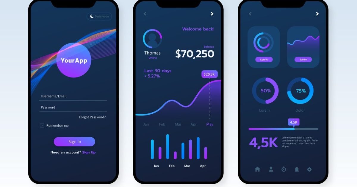
Successful dashboard designs in 2026 center on offering seamless, personalized user journeys that feel natural while still delivering critical insights at a glance. By focusing on accessible, human-centered design principles and leveraging emerging technologies like AI, today’s dashboards go far beyond static information display. Instead, dashboards now aim to anticipate and support user needs proactively, making interfaces both beautiful and functional.
AI-Driven Personalization
The integration of artificial intelligence in dashboard design is revolutionizing user experience. Modern dashboards harness AI to analyze how people interact with an app. With these insights, they can tailor not just content and notifications, but entire layouts to fit individual preferences. For instance, a fitness app may adjust the dashboard to prioritize workout options based on a user’s most frequent times for exercise or provide motivational prompts when the user’s energy dips. The rise of “hyper-personalized” interfaces reflects a growing expectation for technology to respond to users in real time rather than present the same layout for everyone.
Minimalist Aesthetics with 3D Elements
Minimalism continues to dominate design language, but with an innovative twist: the strategic use of 3D elements. Modern mobile dashboards shed extraneous graphics in favor of clear lines and ample white space, reducing cognitive overload for users. Strategic 3D touches, such as softly embossed graphs or interactive charts, add depth without sacrificing clarity. These subtle enhancements offer visual delight and invite users to interact without crowding the screen, representing a fusion between clean modernity and tactile feedback. Publications such as Creative Bloq discuss how the blend of minimalism and dimensionality is shaping contemporary interfaces.
Enhanced Accessibility Features
Accessibility is no longer a luxury but a fundamental aspect of dashboard design. Features like voice navigation, support for screen readers, and easy text size adjustments ensure a broader audience can engage fully with an app. Color contrast and alternative text for graphics allow users with varying levels of vision or literacy to interpret data and respond quickly to insights. Companies are also embedding haptic feedback and alternative input methods, ensuring that those who struggle with touchscreens can still enjoy seamless navigation.
Gesture-Based Navigation
Gesture-based navigation is on track to replace many traditional button-based actions. This approach prioritizes ease and speed, letting users swipe, tap, or pinch to maneuver through data and features. Smooth gesture recognition reduces clutter on screens by minimizing the need for persistent navigation bars. The result is a dashboard that feels fluid and natural, especially for digital natives who expect mobile experiences to be as friction-free as possible. The adoption of gesture-driven interfaces notably enhances accessibility, especially for one-handed use, reflecting insights from design coverage.
Adaptive Dark Mode
Dark mode is evolving into adaptive themes that automatically adjust to a user’s preferred lighting or current environment. These adaptive schemes conserve battery life, reduce eye strain, and provide a customizable experience that appeals to personal aesthetics. Whether indoors at night or outdoors in bright sunlight, messaging, prompts, and data visualizations are readable and visually consistent, offering both comfort and efficiency to users.
Microinteractions for User Engagement
Modern dashboards are elevating engagement by layering in microinteractions: small, purposeful animations or responsive sounds that acknowledge user actions. Microinteractions might include playful haptics when toggling settings, color transitions validating a complete action, or slight vibrations after swiping through data. These subtle cues reinforce the sense of control and make apps feel more alive without overwhelming visual noise, turning routine tasks into moments of delight.
Context-Aware Navigation
Context-aware navigation dynamically adjusts which options are most visible or readily available, depending on user activity, location, or usage patterns. For example, a travel dashboard might prioritize hotel and transport arrangements while a user is on the move, then elevate expense tracking once travel is complete. This approach reduces friction, ensuring that users always see the most relevant features at the right time and streamlining the overall experience.
Design with a Human Touch
As digital interfaces grow more prevalent, users are craving warmth and humanity in their interactions. Leading dashboard designs are responding by incorporating hand-drawn icons, textured backgrounds, or even gentle animations that evoke friendliness and individuality. Personalized greetings, meaningful feedback, and relatable illustrations help users feel recognized and valued, counterbalancing the impersonal aspects of pervasive technology. These touches not only set an app apart visually but also establish stronger, more loyal user relationships.
By integrating these design trends, teams can craft mobile dashboards that are visually appealing, highly functional, and truly empathetic to user needs. Continuous exploration of trend resources and community platforms is critical to staying ahead in the fast-paced realm of mobile design.