When someone mentions fantasy book covers, inevitably a stereotypical image pops up. One of knights standing near dragons, perhaps a chain-mail bra-clad woman with him. Or at least, that’s what used to be the norm. As today’s standards of what’s “cool” and socially acceptable continue to shift, so do the covers of speculative fiction books. Fantasy, science fiction, and horror have moved away from certain styles that were simultaneously clichéd yet easily identifiable.
Moving away from these approaches has a two-fold benefit for both publishers and readers alike. One allows for new readership entirely. A broader appeal is gained with a cover that no longer looks so exclusive to a specific genre. Someone who might not have read a book about kings, White Walkers, and dragons may find themselves picking up a book and falling into it. Those who already love their genres have less to worry about when it comes to the stigma of reading such a book in public (though, again, the shift in today’s society of what’s cool has certainly helped). The ultimate goal, as always? More sales.
Let’s take a look at the three main genres of spec fic to see how they’ve changed. I’ve separated out teen books because while they’re doing much of the same, older teen books have their own distinguishable style.
Fantasy
Obviously one of the more recognized stereotypes of the cover world, a lot of fantasy books had the same concept in their cover art for decades: Characters in, what one might hope, actual scenes from the book. Whether or not these were accurate are debatable. A lot of them weren’t terrible, per se, but some of them were as stereotypical as they could get. The Hobbit is fairly on point with Gandalf, some of the dwarves, Bilbo, and one of the Eagles. However, C.J. Cherryh’s science fantasy novel, Well of Shiuan, is an excellent example of women in absurd armor (and this one is actually better than a lot of others in terms of armor to skin ratio) and well-muscled “barbarian” men. The Sword of Shannara by Terry Brooks is also the usual sword and sorcery concept — although to be perfectly honest, I can’t help but think Oompa Loompa with the gent on the far left.
Today’s upgrades have, for the most part, skipped the typical group of traveling/magicking/sword-wielding folk in exchange for simpler designs. John Gwynne’s Malice features nothing more than a sword front and center, with a bit of warring going on in the background, while The Wall of Storms by Ken Liu is a particularly striking horned skull. While the two still have a solid fantasy vibe, they’re less blatant than older covers – and let’s be honest, they look really cool. It makes them more accessible to readers who may not normally dabble in the fantasy world and could even be mistaken for a different genre. For example, Malice looks similar to Bernard Cornwell’s books which are historical fiction. Other books are shifting straight toward a more abstract or basic impression. V.E. Schwab’s series has each book with a non-detailed figure in them featuring black and red coloring, each one indicating the idea of the book. Here, the character traverses one world to the next — but do you know that right away? Nope. Better pick up the book and read the summary, then!
Science Fiction
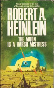
Somewhat similar to fantasy, science fiction means weird aliens, alien plants, a whole slew of spaceships, and maybe the occasional sexy woman. I considered adding in an image of Edgar Rice Burroughs’ A Princess of Mars, but I think this article pretty much shows you all you need to know. Some of these covers are from when the books just came out (doesn’t a 95¢ paperback sound awesome?). The Moon is a Harsh Mistress and Neuromancer both feature the future. One on the moon, and the other on Earth. Things can get pretty colorful on old SF covers. This Ender’s Game cover, however, has stuck around for a very long time (with the exception of a few font changes).
The interesting thing about some new covers is how they’re not afraid to echo the old classics. Old Man’s War takes after Ender’s Game quite a bit in terms of spaceships flying off toward an alien planet. However, artists have changed over the years, and Adobe Creative Cloud has created quite the powerhouse. Today’s programs (like Photoshop, Illustrator, and InDesign) allow artists to create amazing covers from scratch, or enhance images of real people, objects, or places. The Stars are Legion has the same concept of ships blasting through space, only this time it’s much more eye-popping and has a vastly more realistic feel. The same can be said for New York 2140, a much more reasonable expectation of the future than the Daft Punk lights of Neuromancer.
Horror
While horror doesn’t currently have the foothold it may have once enjoyed, it’s still out there. It’s also taking cues from the world and making some changes. Past books, just like fantasy and SF, featured typical horror tropes. Scary houses? The Girl Next Door, check. Skulls? Necroscope, check. Often bloody hands creeping out of places and leaving smears? The Neighborhood, check. You’ll also note that the fonts tend to skew toward sharp like knives or as though it’s been scratched, Gothic, or dripping…like blood, obviously.
Now things are more ambiguous. Trust me, I’ve read The Deep, and you do not know what you’re getting into with that book. The Hatching is a little more obvious with the webbing, but it’s sparseness speaks to the eeriness inside. Relics will make you curious, but still doesn’t necessarily indicate that you’ll find horror inside. The wing is awful, yes, but it could still mean something else. Likewise, the pizzazz of the fonts has left as well, going for either a simple, bold look or, like The Hatching, taking its cues directly from the book and turning it into a part of the cover.
Teens
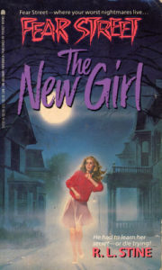
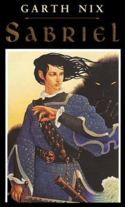
The vast bulk of teen books in the 80s and 90s featured just what you see below: Illustrations of characters right on the cover…and pretty much just the characters. No cool settings. No seriously eye-catching stuff. In a way, teens had to look for images of their demographic to know the book was meant for them. Genre books that teens currently have in spades were sparse. Today, thanks to a handful of super popular titles, readership now spans both older and younger than 13-18, and teen books have exploded. What was once less than inspiring below has gotten much, much more interesting.
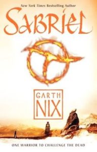
Covers for teen books are now absolutely eye-popping. The Crystal Blade alone is a gorgeous cover, a Photoshop-tweaked photo of a unique crystal dagger made by David A. Falk. A lot of teen books are also turning to more nonspecific covers as well. True Born features nothing more than fog and antlers. Sabriel’s new cover utilizes a fiery symbol. Walk through the teen section and you’ll see dozens of covers that echo these basic concepts. From Sara Raasch’s Snow Like Ashes to Victoria Aveyard’s Red Queen to Michael Grant’s Gone.
Not all covers in these genres are following suit, of course. Some are hanging on to the older concepts, though now with far superior artwork or photography. They do so because they realize this is what readers know, or what some of them expect. David Weber’s books are an excellent example.
One could argue that the shift in covers is simply natural. That they’re changing in order to match with the times, and that’s no doubt true. It makes it interesting to wonder what covers will look like after another decade has gone by. Will some still continue to stick with the classic concepts that early illustrations gave birth to? Or will they change even more to make them indistinguishable from their genres? Only time — and consumer taste — will tell.
8/31/17 Edit: when this piece originally ran, we stated that the cover for The Crystal Blade was “no doubt all made possible by the beauty of Photoshop programs and what today’s artists are able to do with them,” and we have been informed that is not the case and updated the article accordingly.














Okay, that Crystal Blade cover is AMAZINGLY GORGEOUS, and the cover for True Born is giving me serious Hannibal vibes (television show, not film). I, for one, embrace the forward movement covers have taken over the years. I absolutely despised the old-school fantasy covers with a passion. I’d always been interested, growing up, in the Shannara series, because of the word “Shannara” but I could never, ever bring myself to pick up the books due to the covers. I hated them.
Yeah, the second I saw Crystal Blade I got all googly-eyed about it. I just love how teen covers are so badass these days compared to what they used to be. And I never liked old-school fantasy stuff either. It was always just so hokey…bleh.
I concur on the Shannara covers, except that I persevered and read the books in the comfort of my college roommate’s parents house, where nobody could see me
I do love that the new trend for horror covers is “less is more”. It’s surprising how creepy the covers can be with very little to work with.
Less is more is almost always best with horror in general. Especially movies.
And deceptive. SO deceptive. I mean, you seriously don’t know what the fuck you’re getting into with The Deep. That book had me unnerved for days afterward.